Panel
What is Panel?
The Panel is a flexible, drag-and-drop interface that provides a blank slate where you can freely arrange and connect functional components. Like building with LEGO blocks, you can assemble various features within the Panel to create custom interfaces:
Panel Capabilities
The Panel feature offers exceptional flexibility for quickly building various demonstrations or testing platforms:
- Create conversion tools with graphical interfaces for users
- Build testing pipelines with simple, click-based interfaces for production line workers
- Connect components to DBC/LDF file signals, enabling UI changes to trigger corresponding signal changes, see Database
- Bind components to user-defined or system variables to display or modify their values, see Variable
- And much more to be discovered!
Panel Features
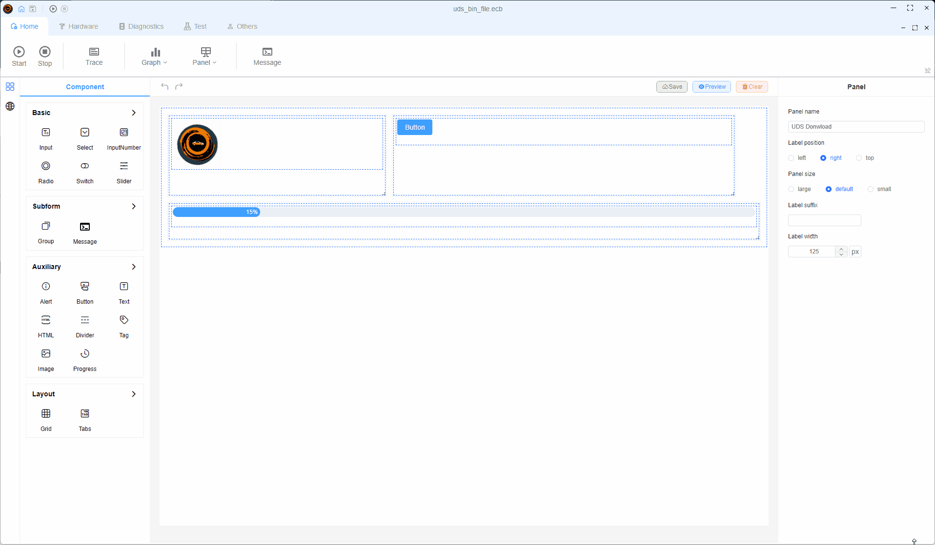
Editing Functionality
The editing interface consists of three main areas:
- Component Area: Contains a wide range of ready-to-use components
- Panel Area: For placing and arranging components
- Component Property Editor: For setting component properties such as signal binding, variable binding, etc.
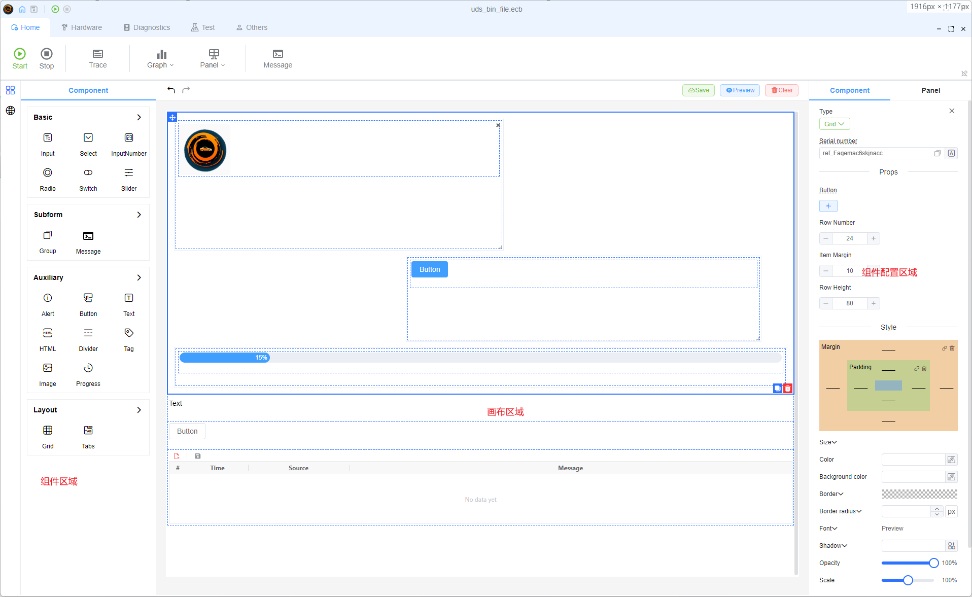
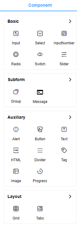
Supported Components
The Canvas currently supports four major categories of components:
- Interactive Components: Buttons, inputs, and other user interaction elements
- SubForm Components: Special functionality components
- Display Components: Visual representation elements
- Layout Components: For organizing and structuring your interface
More component types will be added in future updates, such as dashboard gauges to simulate a car instrument panel.
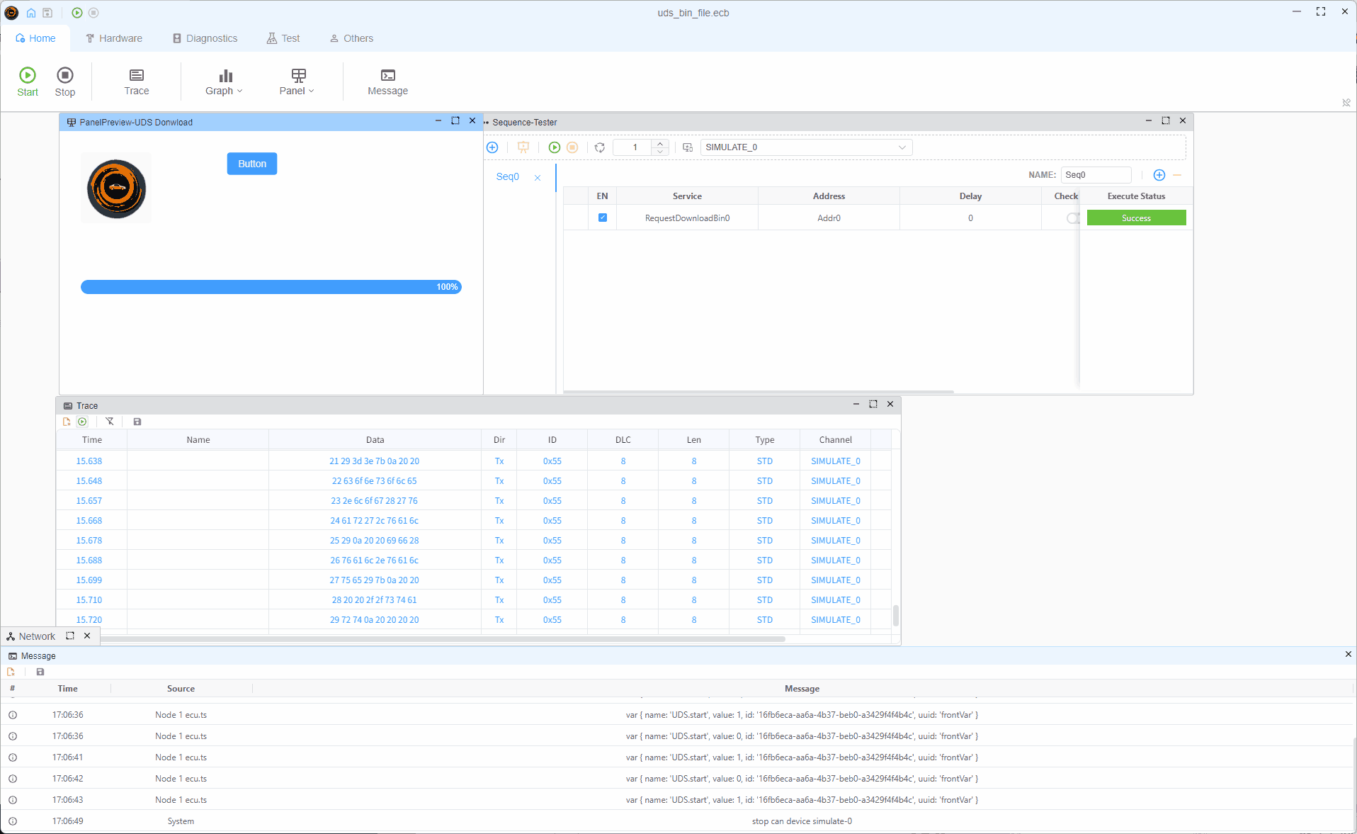
Display Functionality
After configuring your components, users can view and interact with them in the display mode: